


- This is intriguing in light of the fact that it utilizes straightforward shading plans which could be received and things are spread out unmistakably.
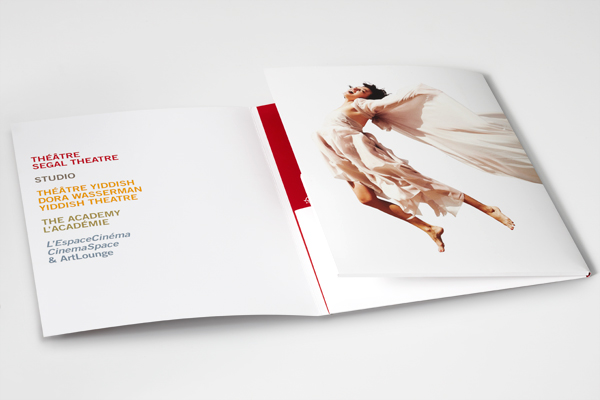
- A more basic design for the substance page with the page magazine segments on the left half of the page and a photo on the privilege, can really go ahead to emit a more modern appearance to content. That, combined with a straightforward dark or white foundation additionally adds to this same appearance.
- With this picture, I will jump at the chance to take the thought of utilizing the principle hero face being spot in the centre.
- From this film advancement I could take the thought of having more than one picture on the front page yet at the same time having criticality.
- This front page hardly uses an type of text at all, which is the theme I am looking to go for.
- One central images , shows all page number, contents page heading big and bold.
- The main protagonist is on the left covering the whole of that side and no bright colours are used
- Bright colours are used but it work. White background#
- This brochure has a landscape layout, possibly making more room to the left or right, depending on the central image subject's position.
- The layout on this cover appeals to me, and the fact that the front cover is a still of the event it sets the atmosphere of a typical film theatre.

BFI leaflet of 2015 unquestionably has tried different things with the utilisation of various hues a great deal, and the shading plan is what they're typically known not. However this handout specifically from them has rather utilised models that has the brilliant plan connected.
In this handout central image gives the idea that film the BFI will be promoting will be a horror movie due to the the scary image look. This is the case due to the extreme close up into the eyes of the character that are being shown in the title. The text that is shown is based in the top and middle third of the front cover and is in big bold writing perhaps to be original.The colour scheme that is used suggests that the content of the film festival booklet may be full of horror films. this is the case due to the dark colours used in the central image.the colour scheme is constant and consistent as it goes together in the genre of horror.
RESEARCH
The title is put withing the top third segment and the organization is surely understood so the title is incompletely secured by the focal picture, likewise a straightforward shading plan of chiefly essential hues is utilized with red and yellows additionally a compelling dark foundation.
No comments:
Post a Comment